


Profound UI is a great tool for creating a web interface for RPG programs. The biggest use so far has been to create or convert web interfaces for standard desktop PCs, but there is a great deal of interest in developing interfaces specifically for mobile devices.
A rich display file screen created by the Profound UI visual designer places components (widgets) on the screen with absolute positioning. This means if you drag a widget onto the screen 100 pixels down from the top and 600 pixels from the left, this is where is will stay. It will not wrap to the next line or stretch to the right side of the page. This is done very intentionally after seeing the difficulty RPG programmers experienced coding html with a CGI tool. We found that when a programmer just wanted to add a button or perhaps an icon to a specific location on the screen they had to first add a column to an invisible table or create a css class to control its position. When the size of the page changed the widget would sometimes wrap onto the next line or move in relation to the rest of the page. This of course can be solved with correct styling but it added another layer of complexity when the RPG programmer just wanted to “add a button to the screen”. Profound UI solved this issue with its drag and drop visual designer because the need to code html and CSS was removed.
Now enter the mobile device.
Mobile devices are smaller so you don’t have as much real estate to work with when designing a screen. You can’t afford to design your screen too small and waste space, nor should you make the screen too large forcing the user to pinch and zoom to re-size it. Your screen needs to fit the device exactly. Another feature of a mobile device is the ability to rotate the device to display a screen in either landscape or portrait mode. In this scenario, a screen must “contort” to fit within the constraints of the new aspect ratio. The absolute positioning approach therefore is not a good fit for either of these issues you are faced with in the quickly emerging mobile environment.
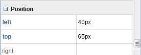
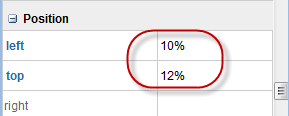
To resolve these issues, a new Layout widget has been added to Profound UI. The layout widget is box shaped that will resize to the device size (portrait or landscape). You can then place your widgets inside the layout, but instead of defining the location and size of a widget using pixels (px) you change the left, top, height and/or width properties to a percentage value (%) as shown.
As the layout is rendered on different sized and oriented screens it will re-size accordingly. Any widgets inside the layout with properties defined as percentages will be sized and located based on the size and aspect ratio of the layout container.
There are a number of different layout widgets available and it is also possible to have nested layouts to allow for complex screen designs.
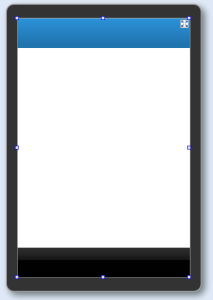 Layout widget divided into 3 sections
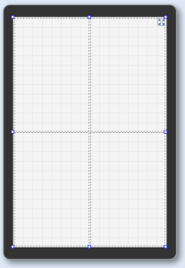 Layout widget divided into quarters
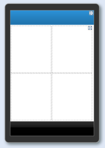 Nested Layouts
Using layouts in Profound UI lets you easily create professional mobile applications written in RPG that you can deploy on your IBMi, without spending a ton of time working to make sure they display properly!
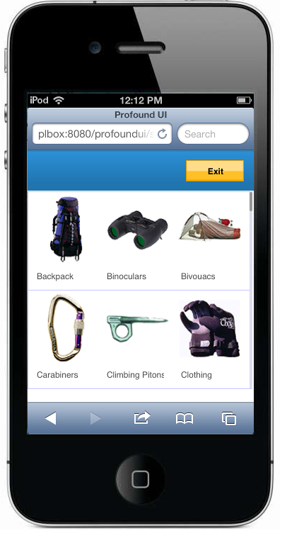 iPod/iPhone Portrait Mode
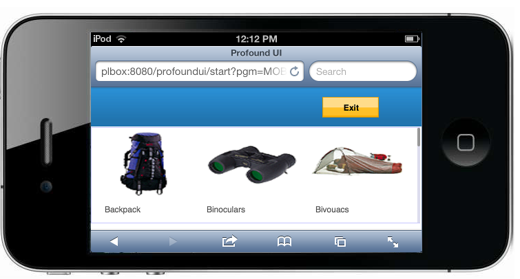 iPod/iPhone Landscape Mode
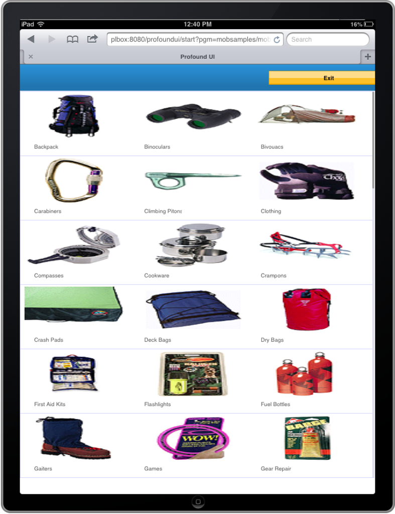 iPad Portrait Mode
