


 As modern-day development continues to grow, it has become more important to build an interactive and responsive design around your content. But what is responsive design, and how can it benefit your business? We decided to tackle some of the big questions that developers seem to have when confronted with the concept of responsive design to help clear up any confusion there might be on the subject.
What is Responsive Design?
Wikipedia defines responsive design as: "an approach to web page creation that makes use of flexible layouts, flexible images and cascading style sheet media queries. The goal of responsive design is to build web pages that detect the visitor's screen size and orientation and change the layout accordingly."
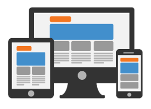
Mobile browsing from devices like smartphones, laptops, and tablets has created extra pressure on developers to adjust accordingly. Responsive design allows developers to create a design that will resize itself according to the type of the device they are using. To put it plainly, responsive design helps software respond based on user behavior and environment. As the user moves from a laptop to an iPhone, the application or web page should respond automatically to the device the user has. Responsive design also eliminates the need to design and develop differently for each new piece of technology that comes out on the market.
The Advantages of Responsive Design?
In a perfect world, there would be enough time and money to build individual sites dedicated for optimization for each mobile devices. But that isn't the tech world we all live in. That is why the biggest advantage of responsive design for developers is the time and effort it saves them.
On top of saving time, money, and effort for developers, responsive design also increases the user's experience. Responsive design gives you the ability to truly customize your content for your particular users and gives them the option of using a broad range of devices. Besides making your content available on any device on the market today (desktop, laptop, smartphone, tablet, etc.) it also sets up your content to be used on any device that is created in the future. Preventing you from having to worry about future device accessibility. At the end of the day, responsive design allows developers to create a custom experience for everyone while saving the developers time and effort.
How Does it Work?
Responsive design for IBM i applications has been significantly simplified thanks to a new widget in Profound UI version 6. The widget enables you to:
- Set up the Responsive Layout widget to achieve the same responsive functionality without writing a single line of CSS code
- Work with CSS Grids in a drag and drop environment and control layouts for different screen sizes.
- Ensure your applications work seamlessly, no matter what device a user chooses
This widget will be explored in detail in our Responsive Layouts in Profound UI Version 6 webinar, presented by Brian May. Watch the webinar to learn how you can easily deliver responsive designs without extra coding.
