


Profound Pro Tips is a blog series focused on issues that our support team receives and questions our Profound Logic customers have. Don't see your question/concern in Profound Pro Tips? Please feel free to contact our team or leave us a comment below.
Today’s Topic: Using Charts with Profound UI Designer
The Profound UI designer is built with a number of popular single series charts built into the widgets toolbox. These charts include the most commonly used styles and provide an easy drag and drop process for adding great looking charts to your screens. However, the charts don’t stop with the supplied styles. Profound UI comes with a license for all the FusionCharts XT charts, widgets, and maps. There are about 100 different chart and widget styles and 1000s of maps available.
Finding Available Chart TypesTo find other chart options browse the list on FusionCharts website at https://www.fusioncharts.com/dev/chart-guide/list-of-charts
You can use any of the FusionCharts XT, FusionWidgets XT, PowerCharts XT, or map options. After selecting a chart type click on the name to find more about the chart’s properties and settings.
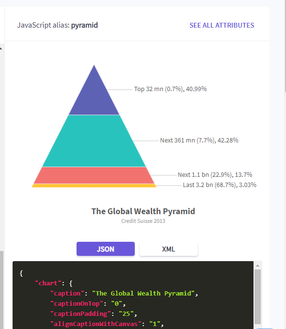 The first thing to find is the JavaScript alias. The JavaScript alias is the name you will need to use for the chart type property in the visual designer.
Below the example chart is a code box that displays the JSON or XML code to create the chart in the example. The code displayed is the code that is needed if you choose to create a chart using the Dynamic Chart properties. This code can be entered into the designer itself or can be loaded from a program field that is bound to the property. Below I will show an example of using the Dynamic Chart chart json property to describe the appearance of the chart and then use some custom JavaScript to load values from screen fields.
Below the sample code is a list of all available properties for the selected chart type. Most chart properties are set by adding them to the chart object of the chart definition. In the visual designer you can set these types of properties by adding them to the chart options property or binding the chart options property to a program field that is a text field holding the desired values. When using the designer’s chart options property, the properties are entered in a list separated by a space.

The only properties of the data object that can be set directly in the designer or through binding are the names and values. Some charts also have additional properties that are members of other objects. For example the LED widget has a colorRange object. While there is not a designer property for this value it can be set either through using the dynamic chart method or in JavaScript code.
Pyramid ExampleSingle series charts can be used in very much the same way as the charts in the widget toolbox. A pyramid chart is an example of single series chart that is not in the standard chart options. To create a pyramid chart drag any of the charts from the widget tool box and position and resize it as desired.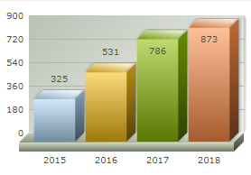
We are going to be changing this 3D Column chart into a Pyramid chart. Since the pyramid chart is also a single series chart, we can set the data the same way we would for the column chart. This could be from a database file, screen data, or static data.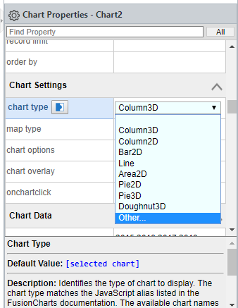
Locate the chart type property in the Chart Settings section. The drop-down list contains all the default chart types. To change to a chart type that is not in the list select the Other… option. Selecting other will change the property field into a text-box where you can type in the appropriate value for the chart type you have chosen. This is where you enter the JavaScript alias value from the Fusion chart website. To change the chart to a pyramid, type pyramid into the chart type property.
Changing the chart to a pyramid type will cause the chart image in the designer to change to a default image of a bar chart. This image is used for all charts that are not in the widget toolbox list as a default placeholder.
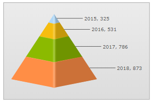 Running the program now will produce a pyramid chart with the same data that we used in when it was a column chart. This will include all of the default features of the chart including animation that separates a section when it is clicked on.
The pyramid chart has a number of options that can be set in the chart options property. These include properties that adjust the appearance of the chart as well as changes to the animation and labels. To use any of these properties enter them in list format in to the chart options property or bind the property to a program field that contains the properties. By binding to a program field, you have the option to 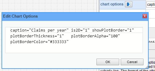 change which properties are set or the value of those properties in the program code before the screen is displayed. In this case we’ll add some properties directly in the designer. The 2D pyramid, and set some border properties for around each section.
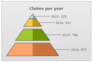
This image illustrates the new look of the pyramid chart and demonstrates the animation effect built into the pyramid chart that allows the sections to be separated by clicking on them.
Using Fusion Widgets as Level IndicatorsThe pyramid chart example showed how easy it is to change a standard chart into any of the other single series chart types. In this example we’ll use one of the Fusion widgets to create a series of level indicators, setting its properties through the chart json property and then linking its value to a spinner on screen.
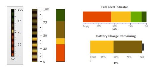
FusionWidgets includes an LED Gauge that can been displayed horizontally or vertically and has a large number of appearance options.
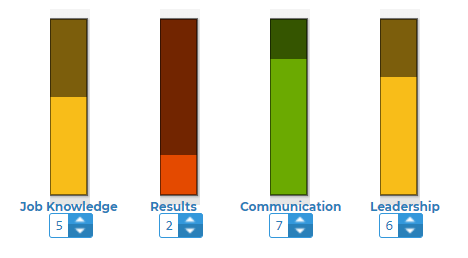
For this example, assume we need to display 4 skill levels (Job Knowledge, Results, Communications, and Leadership) on the screen and provide the ability to adjust the levels. Sliders could be used in this way, but, for sake of example, we will do it with LED gauges.
The first step, as with adding any chart is to drag charts out, size, and position them. Because we are using the vertical LED gauge we want the chart area to be tall and skinny. This will make the default image look funny but will work with the gauge. Checking the Fusion website, we can find that the JavaScript alias for the vertical LED gauge is vled. We will add 4 charts to the screen and change the chart types to vled. Under each chart, add a spinner that will be used to display and adjust the value for each skill. Complete the layout by adding labels for each.
In the diagram I have also placed each gauge set inside a simple panel widget. This will make it easier to rearrange the gauges on the screen later if needed.
In order to simplify the JavaScript coding for the gauges and spinners we’ll use names that will allow us to relate the correct elements together. We’ll use a descriptive name for the spinner, SkillKnowledge, and add the word Chart to end for the associated chart name: SkillKnowledgeChart.
Working on the appearance of an individual LED gauge is most easily done back at the FusionCharts website. Instead of going to the list of charts, drop down the Configuring your charts item. Next drop down the Guages and Widgets and then click on Led Guage. The page that opens includes several examples of different configurations for the chart. More importantly, it includes links to jsfiddle.net pages for the chart or widget where you can test out different properties on a live example.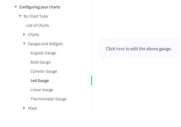
On the jsfiddle.net page add, remove, and adjust properties until you get a look you like. The portion of the JavaScript code that is needed for the chart json property is everything in the dataSource object.
For our skill level indicators I chose to set the following properties:
“chartRightMargin”:”0”, "chartLeftMargin":"0" remove the margins
"showTickMarks": "0" removes the marks off to the side
"ledGap": "0" removes the gaps making the gauge appear as a single solid bar
"lowerLimit": "0","upperLimit": "9" set the limits
"theme": "fusion" is the default theme
"showValue":"0" we will show the value on the spinner
"useSameFillColor": "1" this option works with the color ranges and causes the whole bar to be the color specified for the range that includes the current value.
"showBorder":"0","showGaugeBorder":"0" remove borders
“colorRange”:{…} this portions sets the color that the bar will be displayed in depending on the current value. When the value is between 0 and 3 the bar will be red. From 3 to 7 the bar will be yellow and from 7 to 10, green.
The value property is also set in the jsfiddle.net example but we will be setting the value with JavaScript based on the value of a spinner so this can be left out.
The dataSource portion of the code can now be copied into the json data property for the gauges in the designer. You can delete the value property. But, if you do, make sure to delete the comma before it as well and not the bracket after it.
If you are unsure how much of the code to copy, click on the open curly bracket after dataSource and the matching closing curly bracket will be underlined in yellow.
Paste the dateSource code into the chart json parameter of each of the vled charts. If you leave the value setting in place, you set each to a different value and use the screen preview feature to see what the charts will look like.
Adding the Data Dynamically
We want the chart values to be based on the spinners and for them to adjust as the value in the spinners are adjusted. Each of the spinners will have the value bound to a program field so they will be loaded automatically. We can then add some JavaScript to the screen onload event to set the chart values.
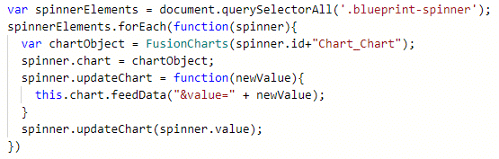 The spinners in our example are from the Blueprint widget set so they each have the css class blueprint-spinner. The css class is displayed in the properties box in the designer. We could also add a custom class but we know each already has blueprint-spinner so it will work for the purpose of selecting elements.
For each of the spinners we find the correct chart object using FusionCharts() and adding “Chart_Chart” to the end of the spinner id. When naming the charts we used the spinner name plus “Chart”. The “_Chart” is added to access the actual chart element within the Profound UI widget. We create a reference to the chart object as a new property of spinner and add a new method, updateChart, to each spinner that uses the feedData method of the chart object to update the value of the chart. The updateChart method can be called to update the correct associated chart later if the value of the spinner changes.
For each spinner we need to set the onspin and onchange events to call the spinner’s new updateChart() method.
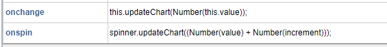
From the Profound Logic Documentation we can see that the onchange event provides this as a reference to the element that was changed and this.value provides the new value. Since we added updateChart() to the spinners we can simply use this.updateChart() and pass the this.value as a number.
The onspin provides spinner as a reference to the spinner element. The value provided in onspin is the value before spinning so we need to add the increment amount which is also provided.
The Finished Product
We added 4 charts and spinners. After changing the chart type to vled we added chart json to define the appearance of the chart. A simple loop in the screen onload sets the initial value as well as adding an updateChart() method that ties each spinner to the correct chart. Then we just add calls to updateChart() in the onspin and onchange events for each spinner. Now we have skill level spinners with indicators that change from red to yellow to green based on the value.
This article provides a couple examples of additional charts and different ways to implement them in Profound UI. The Profound Logic Documentation site contains several pages providing more details on implementing charts and maps and the FusionCharts website has all of the specific details for each chart, widget, and map type.
