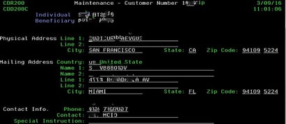
Over the years Profound Logic has been helping companies maximize the use of their IBM i systems by helping them to modernize their 5250 green screens to a more user friendly Web 2.0 interface. We have been fortunate enough to help many great companies modernize their data without having to completely rewrite their system or leave the IBM i altogether. In this series of blogs we want to highlight some of those customers who we have helped through out the years. Through this blog series you will get to see before and after pictures of their modernization efforts, as well as hear from the customers themselves.
This week we are focusing on Sterling Bank and Trust, and the help we were able to change the perception of their system at the bank
Changing the system perception at Sterling Bank and Trust was a large reason for their modernization effort. They decided to use Profound Logic to quickly change their green screens into a GUI environment. Once they switched over they were able to connect all their data and easily interact. Profound UI allowed them to make the jump to mobile devices without a lot of training by allowing them to create shortcuts to the mobile environment simply and easily.
 Their users also began to perceive that the system had been modernized and more intuitive due to the web-based GUI that had been designed with the Visual Design tool. They were able to use charts to drill down 'big picture' information to minimal details, allowing management to make better educated decisions on high level issues.
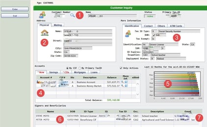
With the Profound Logic Designer tool, the Programming Analysts were able to create an application to join at least 10 different green screen application into one screen. The user can now see the big picture of a customer on one efficient screen, helping customer support.

The customer inquiry application screen brings several different green screen applications together in one place:
1) The magnifier icon is a link using a customer search with links cross referencing between customer connections.
2) Tabs allow Sterling employees to have similar information in one section. The example here is physical address and mailing address.
3) More tabs: Identification, contacts, ATM cards.
4) Accounts associated with the customer (NOW, Savings, CD's, Mortgages and Loans) are included from a separate green screen application. Previously showing all these together in one location use to be impossible. Once each account is clicked will refresh the chart showing the last 12 balances day by day.
5) This chart displays the balance of the last year, there is an application in development to click the chart to go deeper and display another chart with the balances day by day.
6) A list of the groups associated with the same customer.
7) Emails associated with the customer, using the hyperlink functionality by clicking the email address.
Having 10 different green screen applications displayed on one screen modernized their customer service efforts and made gathering data that much easier.
Our second annual Profound Logic User Seminar (PLUS) is coming up! Register today to reserve your spot for this three day seminar that includes: hands on workshops, key Profound Logic speakers, and both Basic and Advanced learning sessions. The Seminar takes place November 15th-17th. Register Today!


