Profound Pro Tips is a blog series that is focused on reoccurring customer issues that our support team receives and aims to answer questions our Profound Logic customers might have before they even have them! Many of our customers have similar questions and concerns which lead us to create Profound Pro Tips... an easy to reference set of reoccurring questions you might have. Don't see your question/concern in Profound Pro Tips? Please feel free to submit a support ticket and our amazing support team will be happy to help any way they can.
This week we are discussing a quick and easy way to create custom themes for a custom CSS panel/button...
Many of our customers have asked how they can modify and create their own custom themes for CSS panels (as well as CSS buttons). Profound Logic offers 7 themes with the product: black, blue, gray, light gray, yellow, green and red. Each are assigned a single letter A-G (in that order) and all themes must be labled with a single letter . You can pick any of the given themes and modify that existing theme to your desire. Follow these steps to be able to access the customizable themes:
1. These "themes" are located in the IFS: /www/YOUR-INSTANCE/htdocs/profoundui/proddata/css/profoundui.css
2. Inside the profoundui.css file search for "/*Swatches*/". This will take you to the start of where these themes are defined.
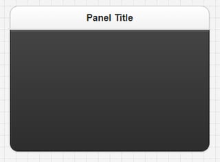
3. The first theme you will see here is "A" or the black theme (note: all of the selectors in this group end with "-a").
4. Copy one of the groups that already exist, modify it based on your preferences, and then rename it. All new themes must be a one character name. We suggest starting at "Z" and go up if you need more then one saved theme.
For example, if you wanted to use theme "A" and make some changes to it to create a new theme, you would: copy this theme, place the copied theme in a new file named "Z" (for example), modify the theme to your liking (using "Z" as the one character name for the new theme), place this file in the following director:
/www/YOUR-INSTANCE/htdocs/profoundui/userdata/custom/css/
Then use Z in the "other" option for theme property in the Visual Designer. You should see your CSS panel change depending on the changes you made to the theme.
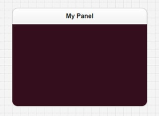
Here is a simple color change from black to maroon to show case a custom theme:


It is important to note that if you will be launching this application through Genie, you'll need to reference the them's CSS file in the start.html template of your Genie Skin in order for it to work properly. You would add a line like this to start.html: <link href="/profoundui/userdata/custom/css/Z.css" rel="stylesheet" type="text/css" />
Hopefully this helped you begin to customize your CSS theme panels and buttons! If you need any more help with customzing your panels and buttons please feel free to reach out to our support team! Did we answer your question? Do you have another question we can answer? Leave us a comment below and we will be happy to help!
Profound.js harnesses the power of Agile Modernization and Node.js for IBM i application modernization. For more information on Profound.js 2.0 and how to get started with it click here!


