


As a company trying to move people off of AS/400 terminal screens of the 80s, we're happy to see them modernize to any type of graphical interface. They look better than the green screens every time but nowadays even GUIs can look outdated. In this blog we're taking a step back to look at how UI design has progressed through the ages.
The Rise of the Machine (70s - Early 80s)
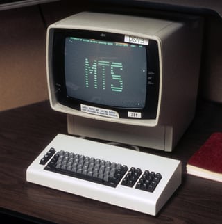
Let's begin with the rise of the personal computer. The PC was still in its infancy and so was its interface. The screens at this time were for the most part text based. Black screens with a few monochrome pixels of text to be exact.
 |
 |
Oh wait...your screens still look like that???
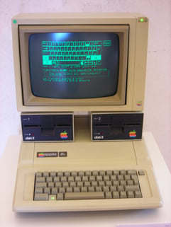
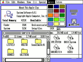
Introducing Color (Mid 80s - Early 90s)
This is when computers started becoming more practical for widespread usage. A "home computer" started to make sense when smaller open-source machines like the Apple II and the IBM PC came to market. The screens at this time gained capabilities to display limited color palettes and graphical elements like charts and graphs.
 |
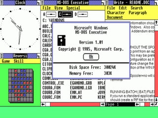 |
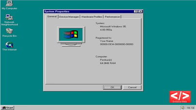
PCs for Everybody (Mid 90s - Early 2000s)
This was when every home seemed to adopt the personal desktop computer. When I think of UI Design in this era, I think Windows 95. Many people were still getting the hang of menus, buttons, and multiple screens—and for some reason, they were all variations of solid gray.
 |
 |
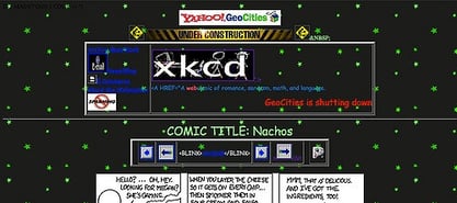
During the tailend of this era also emerged something that changed our lives forever, the internet! The entire world was connected through a virtual network of Geocities and Angelfire websites.
 |
|
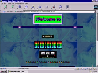
It sure wasn't pretty but it was still amazing. You could create a page and share it with all of your friends and even to strangers across the planet!
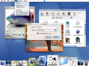
Web 2.0 (Mid 2000s - 2010)
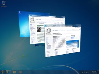
As graphics technology imroved drastically, designers pushed its limits to make elements look as fancy and life-like as possible. UI design shifts from being text-heavy to graphics-heavy. 3D effects like drop shadows, gradients, and transparencies are everywhere, indulging our senses with multiple levels of depth and color. A lot of websites and applications you encounter today probably still look like this.
 |
 |
 |
 |
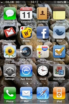
Another reason for the overly large buttons and super-realistic icons was to help users with accessibility on a mobile device. Smart phones and tablets grew wildly in popularity and people were still getting used to using a touch screen.
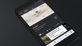
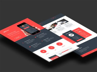
The World Is Flat (Early 2010s to Today)
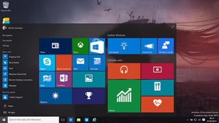
Fast-forward to today and it's all about flat design. We've already proved we can make things as fancy as possible—so we've dialed it back on the special effects to focus on functionality.
This era of flat design dismisses the heavy usage of gradients and shadows to create...well...a flatter image. Today's signature look emphasizes typography, high-res photography, white space, and solid colors.
 |
 |
 |
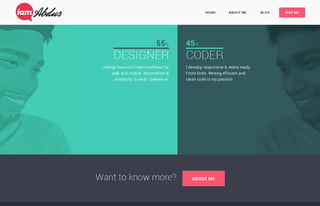 |
You'll see this minimalistic design everywhere from websites, mobile apps, print advertisements, and it's even made it's way to desktop applications. I personally love this style as a graphic designer because of how easy and beautiful it is. I really can't imagine what the next era of graphic design has in store of us because I'm currently loving this one.
Which was your favorite era? Let me know in the comments below!
For more examples of modern UI design, check out our customers' finest work here.
